← All work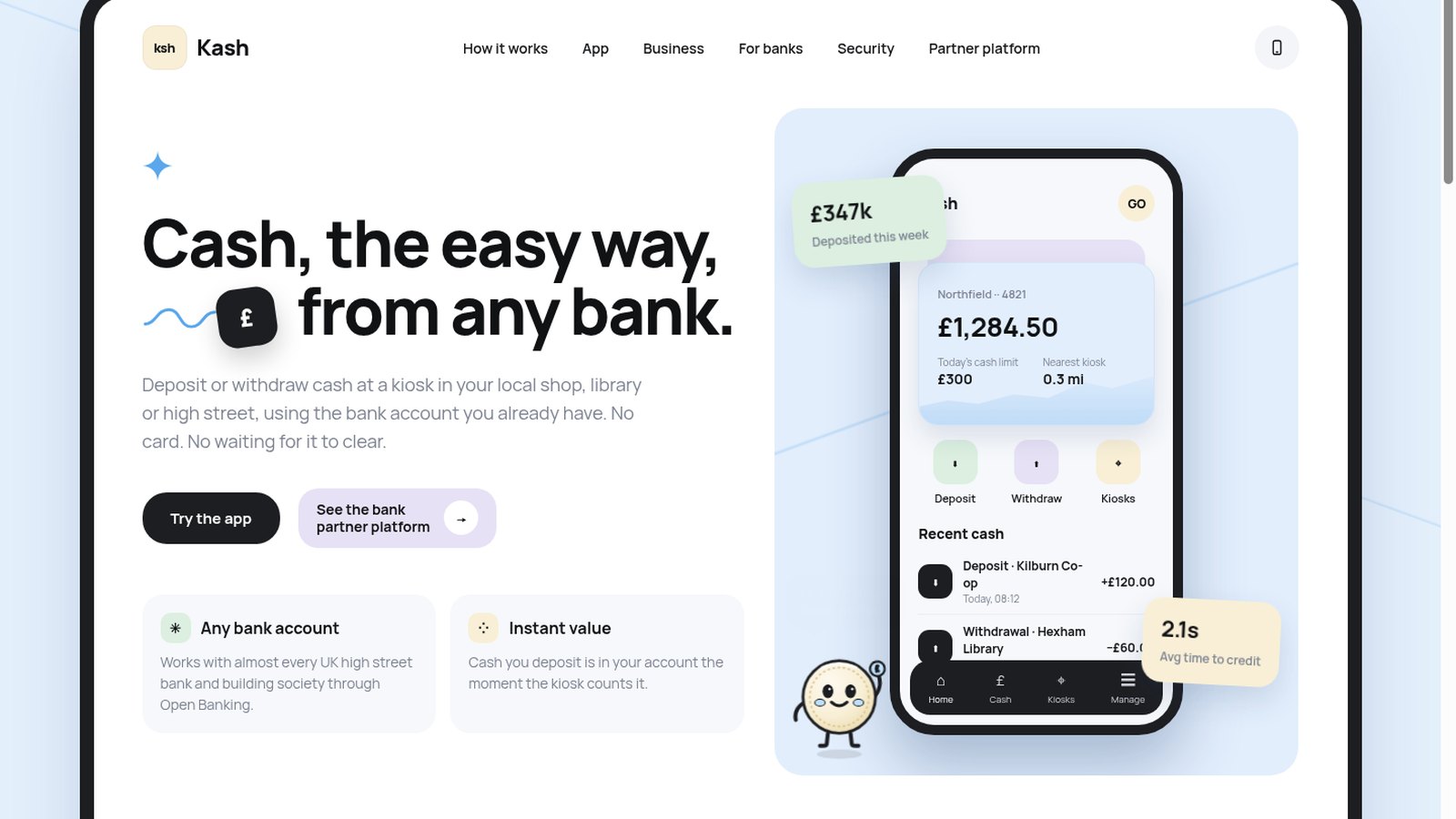
Case study 01 · Fintech · Cash access
Kash.
Cash in and out at a local kiosk, started from the bank app you already use.
Case study 01 · Fintech · Cash access
Cash in and out at a local kiosk, started from the bank app you already use.
Bank branches and ATMs keep closing, but plenty of people still run their lives in cash: small shops banking the day's takings, people who budget with notes, anyone who simply trusts what they can hold. Shared kiosks in local shops, libraries and high streets can fill the gap.
They only work if starting a deposit feels as easy as tapping a card, and if the bank can trust every note that goes through a machine it doesn't own.
So the brief: make paying in or taking out cash as quick as a card payment, from any bank, and give banks one clear view of every kiosk and every pound.
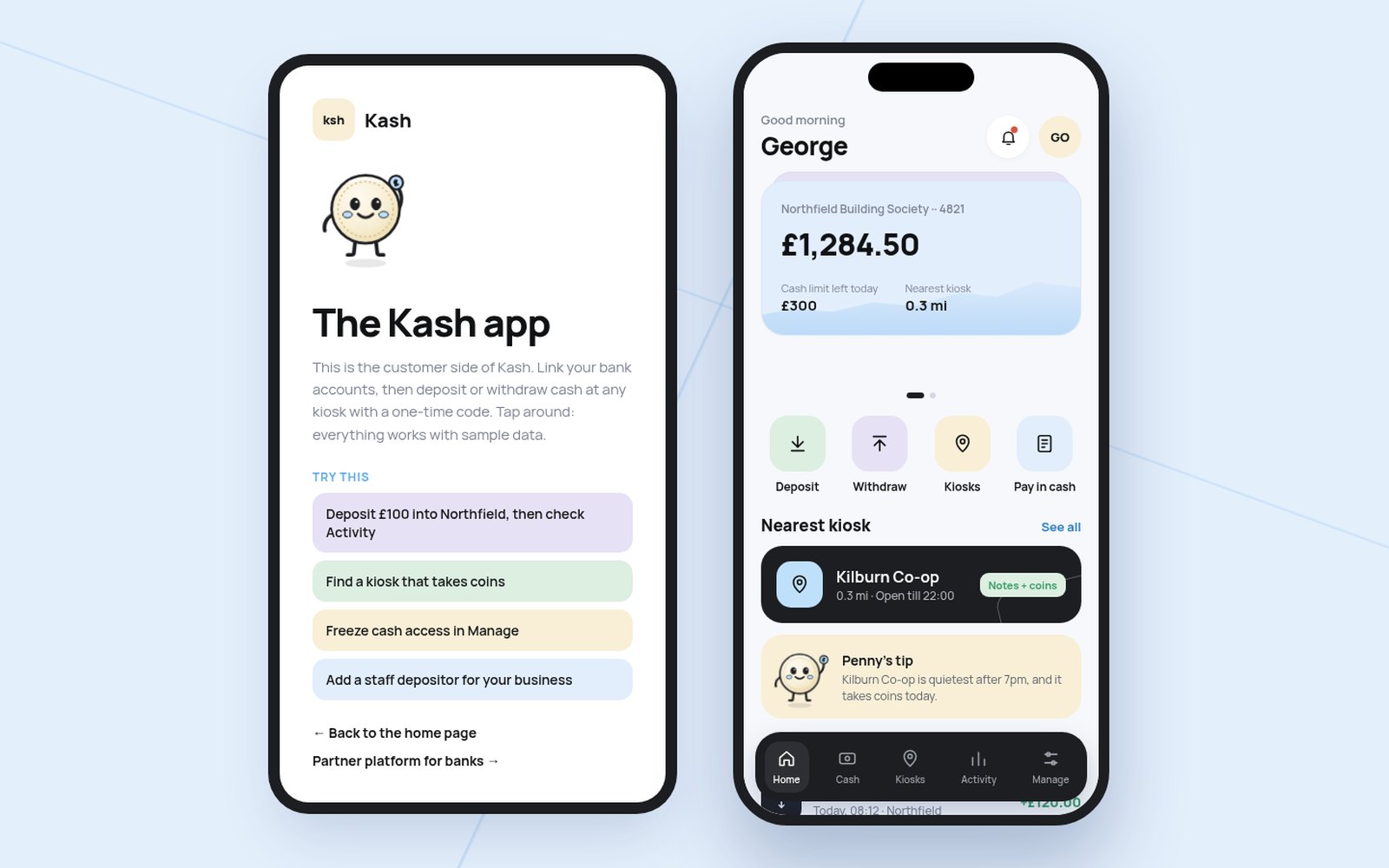
No card and no extra download. Pick deposit or withdraw, the amount and a kiosk, then finish at the machine with a one-time code or QR scan.
A deposit lands in the account the moment the kiosk counts it, so people never wait days for cash to clear.
The same kiosk works for customers of different banks, linked through Open Banking, so a town needs one machine, not one per bank.
Owners can add staff depositors with their own limits and pre-order a change float to collect.
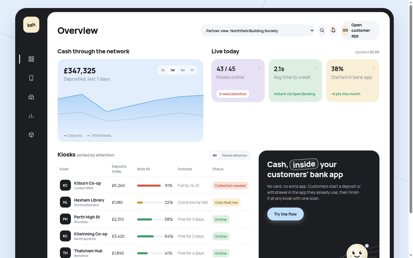
The bank view puts machines that need a collection or a coin top-up first, with a forecast of when each one fills.
Every kiosk count is matched to the ledger. Exceptions such as a failed dispense or a suspicious pattern of deposits come with a plain reason and a resolve action.
Cash users are often the people least comfortable with new apps, so Kash has a guide: Penny, an animated coin who waves on the home page, shares tips in the app and cheers when a deposit lands.
I tested Penny against a plain animated logo in an A/B comparison across every screen. Penny won. She makes a money product feel approachable without making it feel like a toy.
A home page that explains Kash to customers, businesses and banks. A customer app with linked bank cards, deposit and withdraw flows, a kiosk map, activity and controls to freeze cash access or set limits. And a partner platform for banks: network cash flow, live kiosk health, business accounts, reconciliation and the roadmap.
Kash is a concept on sample data, so these are targets, not results:
The interesting work was not the kiosk. It was the handoff between a bank app, a machine in a corner shop and an operations team, and making each side trust the others. That is the same platform problem I have worked on in payments for ten years.